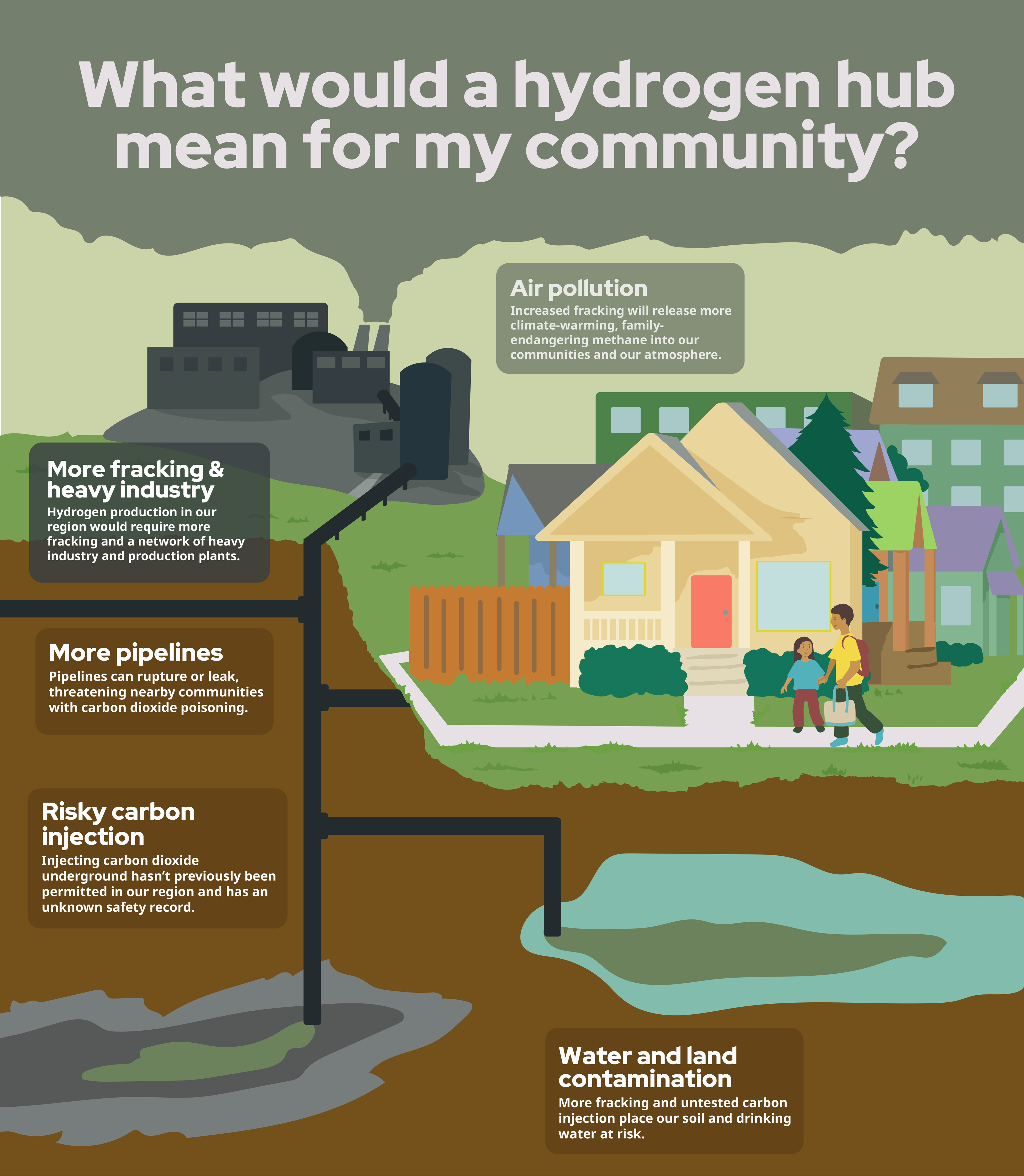
This infographic was created in support of our hydrogen hub work with the Ohio River Valley Institute: an infographic that clearly and accessibly lays out the dangers of hydrogen production and infrastructure to communities.
""We're really grateful (and excited!) to have this resource at the ready..."
Check out the previous drafts to see how we landed on the final product
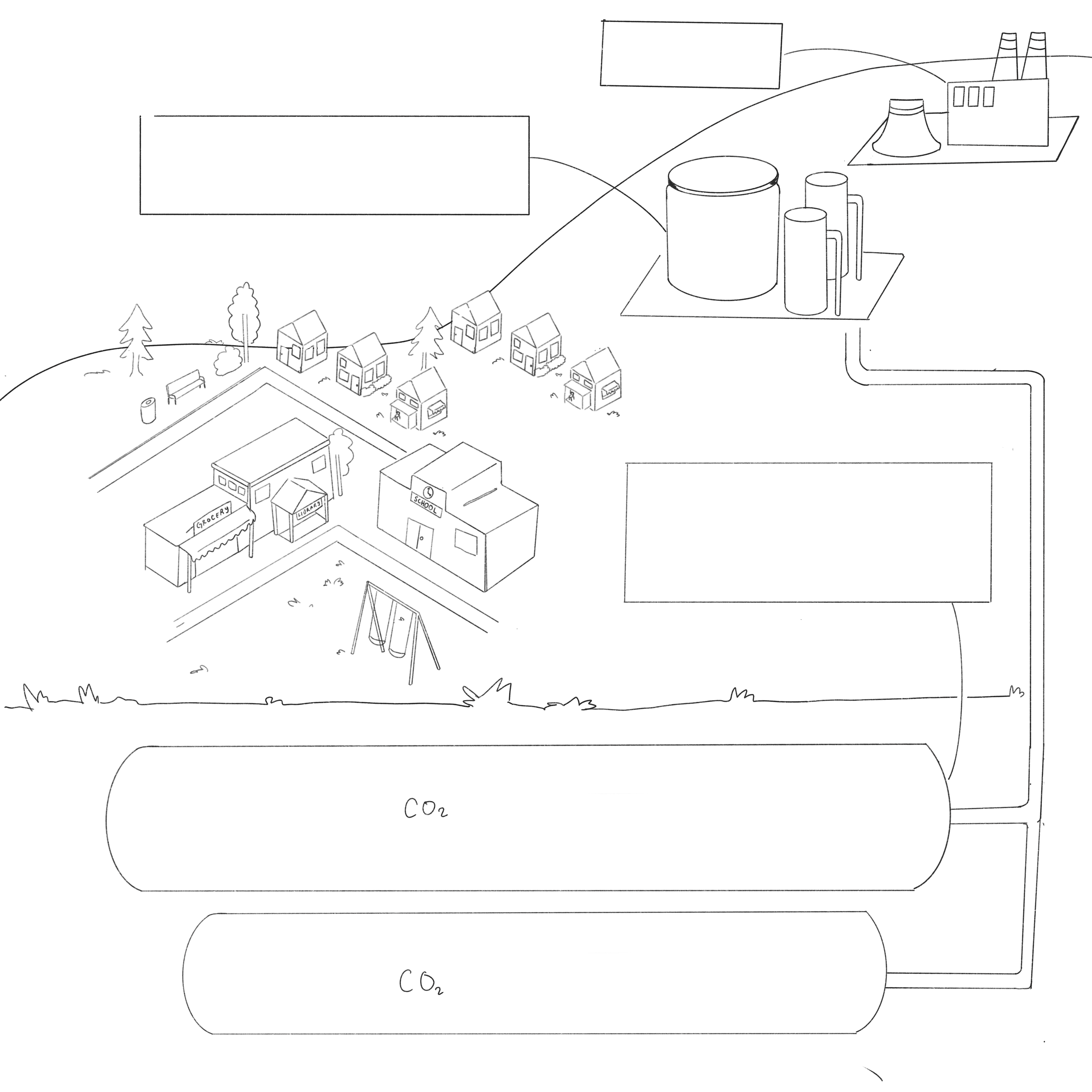
Round 1 (left): Feedback on the first draft noted that the client wanted the hydrogen hub closer to the community to give to greater sense of what it would be like to have the proximity of the hub near your home. They also wanted to go without the arial view and have us add people to the infographic.
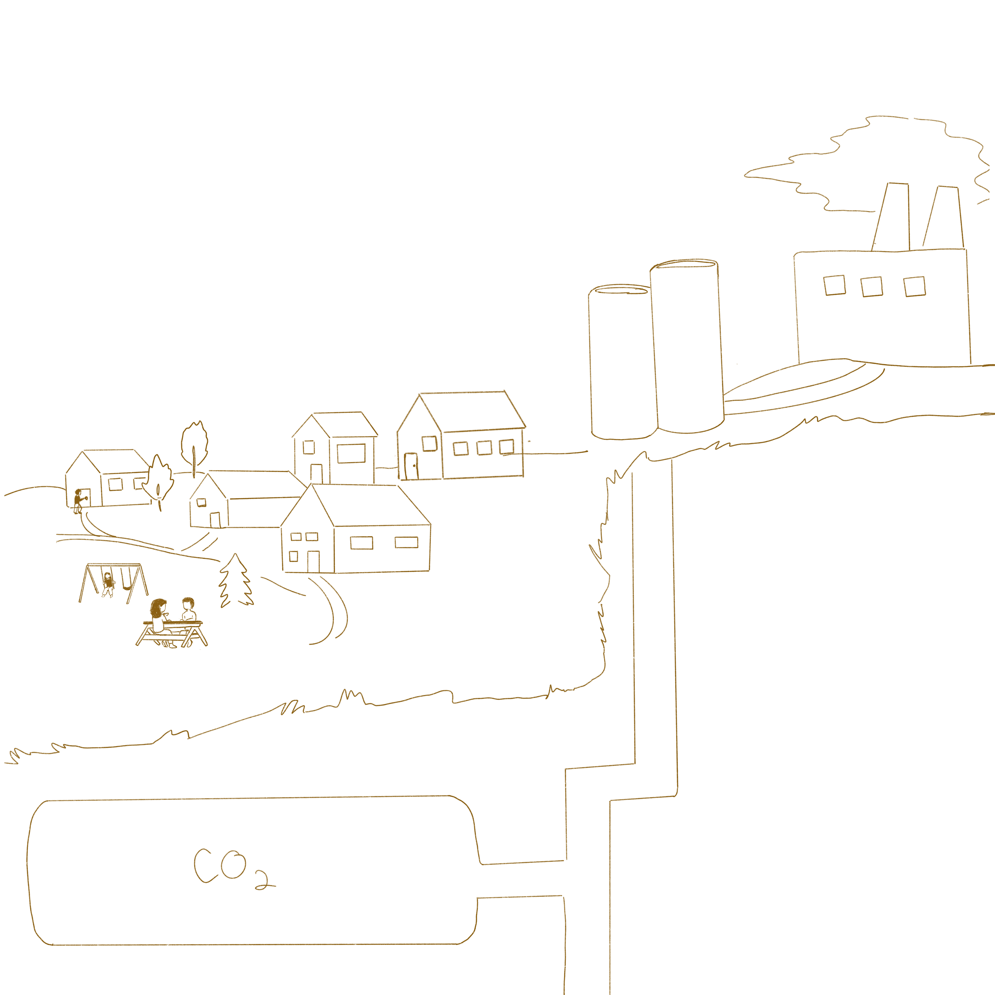
Round 2 feedback: The client requested we make the hydrogen hub even closer and show the people at home instead of at a park.